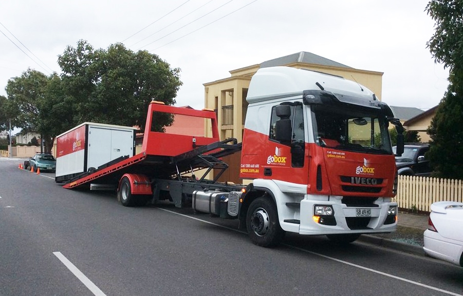
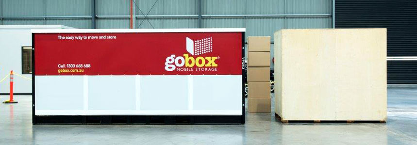
gobox provides mobile storage solutions that are delivered straight to your door.
Their unique lifting and moving system means that their storage units can be delivered and manoeuvred into spaces that other container storage providers just can't get to.
With storage delivered to you, it greatly reduces the stress of moving your household items due to its convenience and security.
To learn more about how it works, this is a great gobox explainer video.
Unfortunately, many companies don't spend enough attention improving the user experience of their website.
With many alternatives to most products and services online (even gobox!), what makes a company stand out and stand apart is their ability to improve user experience.
A key reason for this shift is due to the increased accessibility of products and services online. If all a user wanted was a solution that would satisfy their need, why should they pick you?
For gobox Mobile Storage, many of their customers who are looking to order a gobox needed it yesterday.
Whether it is because they are in the process of moving home, renovating, or needing additional storage space because of fires and floods, their prospects want to be able to make a decision and request a quote fast.
By helping the end-user find the information that they need, gobox could receive more enquiries without increasing their advertising budget.
Although ongoing optimisations and changes to paid traffic were important and influential, this blog will highlight two key examples of how improving the user experience on a website can translate into financial benefits for a company.
This was achieved with our Conversion Rate Optimisation service.
Optimising The Website After Observing Visitor Behaviour
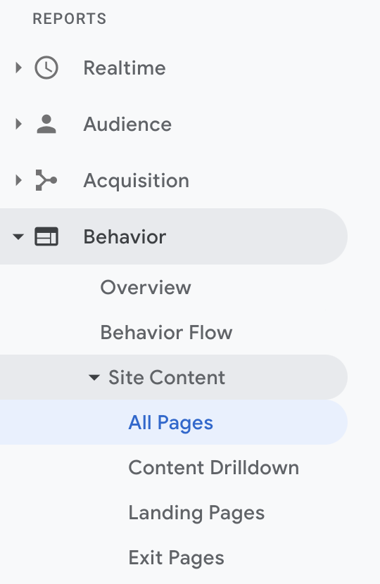
When reviewing the 'Behaviour' category reports within Google Analytics, certain pages, when viewed in a user session, contributed to a far greater quote form conversion rate.
In fact, it was observed over time that users who visited the 'How We Compare' page (how gobox compare against their competitors), had a 10% conversion rate for Quote Form submissions. This conversion was far greater than the website average.
So, to make it easier for website visitors to navigate to the 'How We Compare' page, it was prominently added to the navigation bar.
Because the navigation bar is 'Sticky', it meant that a user would always be one tap or click away from visiting this important page.
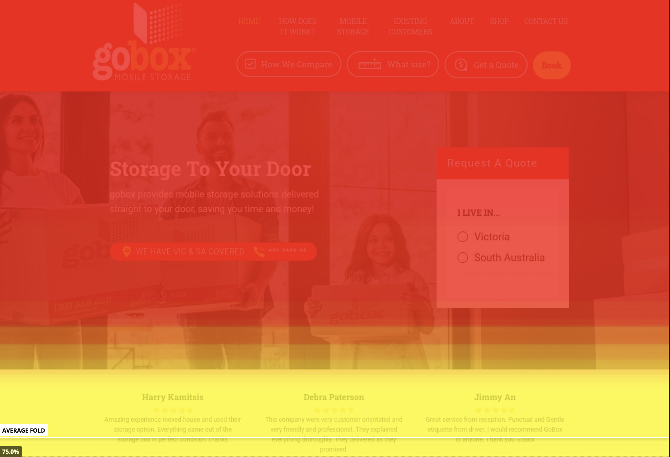
With Hotjar installed, it was also identified that any behaviour that required scrolling or clicking provided some users with enough friction to prevent them from navigating further on the site.
In fact, it can be seen that 1/4 users don't scroll beyond the Average Fold of the website.
Therefore, it was also important that this Call To Action was always visible on the page, as some users may not have the patience to scroll or click additional times to find the high converting 'How We Compare' page.

This was achieved by adding a clear CTA, encouraging users to visit their 'How We Compare' page.
Reducing Friction In The Conversion Process
Once a user had decided that they would like to request a quote from gobox, they were historically required to navigate to the 'Get a Quote' page and then fill-in this lengthy form.
Now, many fields in the form are required so that the support team can provide an accurate quote. To reduce the friction in the quoting process, we tested two hypothesis.
1) That a shorter Quote Form (with reduced fields) would result in a greater conversion rate. As we have learned, there are significant user drop-off rates if we expect them to scroll, or focus for any short period of time (thanks, TikTok).
2) That having a quote form feature on the homepage of the website, would result in a greater conversion rate. Because of the circumstances that a user is typically in, when searching for a service like gobox, it's likely that they will want to make a decision quickly.
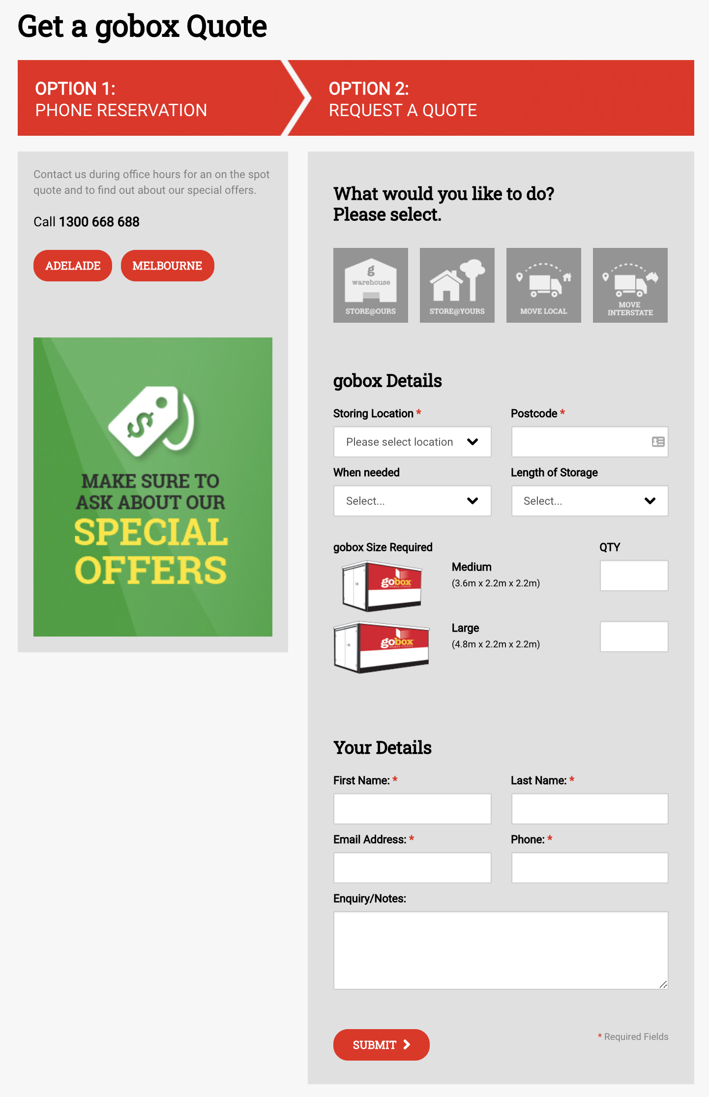
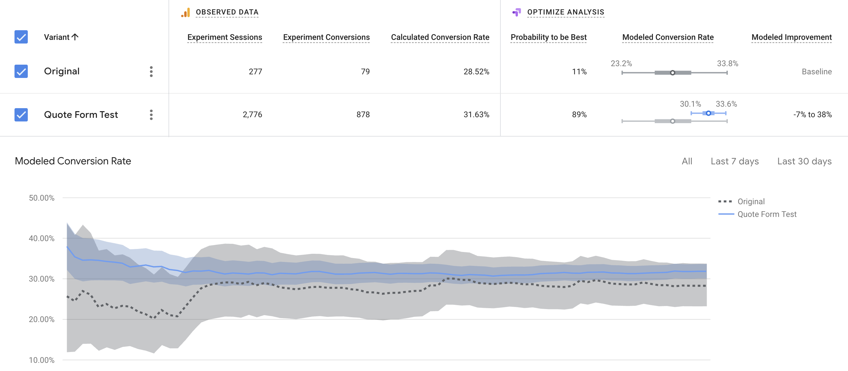
With Google Optimize, we reduced the total size and fields of the form. We then created an experiment, which ran equal traffic to both the 'Original' and the 'Quote Form Test' page.
From this experiment, it was identified that the Quote Test Form had a greater form submission conversion rate. Over an extended period of time, we then allocated more and more traffic to the 'Quote Form Test' winning variation.
Knowing that we could improve the conversion rate, by simplifying the form (answering Hypothesis 1), it was decided that the form to be used on the homepage (to test Hypothesis 2), would be a simplified form.
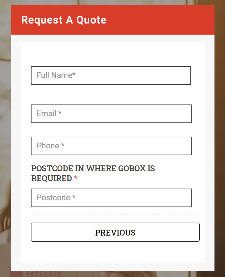
Without disclosing too much information, it was confirmed that, after making this change (in conjunction with the 'How We Compare' change), the total number of quote form submissions that gobox received has increased by over 100%.
This increase in form submissions is also without any increase in their set marketing budget. Win. Win.

Guy Wilson
Director of gobox Mobile Storage
"We have developed a great partnership with Market Ease Digital over the last 2 years.
They have been able to improve on our existing efforts in Paid Advertising and they have also identified new opportunities to receive more leads. In fact, we now receive 100% more leads, without increasing our advertising spend.
I have personally appreciated their analytical approach and their ability to translate data into actionable insight."
Let's Talk!
If you would like to get more from your digital marketing campaign(s), or if you would like to learn more of about the points mentioned above, let's have a chat.

